- aliciasteudel
- 6. Dez. 2019
- 4 Min. Lesezeit
Nowadays we are surrounded by advertising almost everywhere and at any time, so that we sometimes don’t even perceive it, at least not consciously. One of the main goals of a poster often seems to be to be as shocking and extraordinary as possible, so that it does not get unnoticed among the immense amount of advertising by which we are over flood by. That’s why I wondered what a poster needs in order to be perceived and what makes it worth to be looked at.
The central question for a designer will probably always be, which message he wants to convey. This leads to the question of which atmosphere should be created and which emotions should be evoked. To implement his corresponding decisions, the designer should think about image content, image design, the color concept, fonts and layout (which includes image positions and font positions).
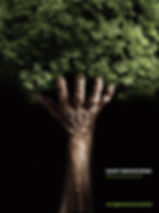
The present poster, titled „Humanity and nature are one“,shows, in front of a very dark, almost black background, the front side of a human forearm and a hand, with five slightly spread fingers that is inclined in direction of the viewer. It is a strong, older hand, the skin color is dark, maybe from a hybrid with African and white roots.The hand „carries“ a dense „crown“ of narrow, rich green and healthy-looking leaves. Viewed from a distance, the image looks like a tree, the forearm forms the trunk of this tree, the four fingers (the thumb almost disappears beneath the leaves) look like strong branches supporting the crown of the tree. The photograph is a work of Humberto Utrabo and transposes the written text on the right side, in the lower half: „Humanity and nature are one“ with a strong pictorial language: the human arm and the hand form the stem for the powerful nature growing out of it in form of fresh green leaves.
The text is set in a grotesque font. This can be identified by the fine lines of the letters which don’t have serifs. According to my internet research, this poster is the work of Felipe Précoma and Ricardo Leite for a Brazilian advertising agency called „Segmento“, whose managers are committed to protecting the environment and hereby at the same time promote their own business. Below the main title we see the line „follow our tips and help to preserve lives“. It is difficult to judge from here whether the advertising agency actually gives useful tips to protect lives.
I think the message that asks us to build up a positive connection between man and nature is very well implemented through the combination of the human hand, which symbolizes the human in this interaction, with the full leafy top foliage that symbolizes nature. Unlike other environmental campaigns that I have seen, which focus more on the issue of „man against nature,“ this presentation attempts to transmit a positive picture of the interaction between humans and nature. The picture triggers interest because firstly it seems to show a tree and yet it becomes clear quickly that the trunk and the large branches bearing the crown are in fact human limbs.
On the other side I ask myself if human don’t get (again) a too important role in this picture in comparison with nature: Without man as the stem out of which everything grows there would be no leaves, so no nature. Starting from the idea that human and nature are (or should be) one and that man is rather a creation of nature than nature a creation of man, the poster loses meaningfulness: Man should understand himself as a part of nature; he should behave in a respectful way with his natural resources. He doesn’t do so. He dominates nature, exploits and destroys nature. He saws the branch he is sitting on.
Although “nature” is symbolized in the upper part of the picture as “crown” (…of the universe) supported by the human hand, it looks at the same time as if all human is the base and condition for the existence of nature. That reminds me the over self-esteem (hybris) which led humanity to the point where we are: to the destruction of nature and towards the verge of self-destruction.
The poster conveys that man should give support to nature and asks us to assume a more responsible role in order to improve our relationship with nature where, until now, we take more than we give. Maybe the poster does not convey his message in an optimal way as it does not transmit the very concrete feeling that man has to change his behavior completely. It even gives me a feeling of quietness: “everything is fine”.
The chosen fonts and the information in the text are discrete and of minor impact and are only perceived after closer observation. But possibly this is intentional because the desire is, to firstly capture the attention of the viewer by the picture and once he has been attracted make him read (and think about) the text message. Indeed the poster captured my attention and interest. It is photographically and design wise very well composed and it provokes thinking about the theme it is talking about.
